Case study: AI-Assisted Product Design
As a designer today, it's very important to stay up to date with the latest techonolgies and to be using AI in our daily work. I thought I'd share my experience and way of working with AI here. This is just a small exercise to show you how I would enhance my work with AI and what my key takeaways are from using AI in general when designing.

Concept
After trying several apps and finding they all fell short, I knew exactly what I wanted to build for my AI-driven portfolio case study. I wanted to build an app for more than just making lists, I wanted some sort of family management app.
The vision was: a space where you can manage daily grocery lists, store essential family 'safe-keeping' notes, like preschool info or birthdays, but also easily split monthly bills. Most importantly, everything is built to be shared and edited easily.

User flow made with Miro's AI assistant
Process
I had an idea what features I wanted in my app. So I asked Miros AI assistant to create a user flow for my app, after I've given it the context and clearly stated which screens where the key functions for my app it presented a user flow for me, which I've used as a basse for this case study.
Wire frames
Creating wireframes is often a tedious process that takes much longer than we’d like, yet it’s a crucial step to make sure the design solves the problem and moves the user smoothly from point A to B. For this task, I decided to use Figma Make. I expected to just clean up a few minor details afterwards, but the reality was quite different.
After several rounds of prompting, it became clear that while Figma Make could produce something visually polished, it struggled with the core UX.
The layouts looked good at first glance, but the logic was all over the place. It kept hallucinating extra functionality I hadn't asked for, resulting in a UI that was much more cluttered than I wanted.
Ultimately, I realized that for the quality of result I was aiming for, there was no shortcut here. I went back to the 'old-fashioned' way and built the wireframes manually in Figma to ensure every detail served the user journey.

Some of the wire frames that Figma Make created, but where of no use to me.
Visual language
One way in which AI is of good help to designers is in ideating visual language and styles.
Again, I used Figma Make and prompted it to give me 5 examples of different visual styles, and gave it 5 words that would describe the styles such as "modern", "elegant" and "expressive". After finding a style that worked for me, I imported the style to Figma, where I tweaked it a bit to make it more crisp and more user friendly as Figma Make tends to over design some details.
A pro tip, which I learned from Koi Studios, is to ask the assistant to add buttons at the top of the page that let you switch between the styles created. This makes it easier for you to toggle between the styles and compare them to each other. See in the example below.
Example of the theme toggler in Figma Make.
Building a Design System
Now that I had the user flow, the wire frames and the visual language, I needed components to actually build my screens.
This is how I used Claude to help me build a design system in Figma.
Firstly, I asked Claude to create a folder in my documents simply called Components. Then I wrote a very specific prompt with in dept context about the app and specified that I needed a design system for mobile apps and what sort of components I needed for it. I also asked Claude to follow the latest WCAG guidelines.
Claude now built a design system locally for me in HTML/CSS which I could preview in my browser and after some tweaking rounds until I felt satisfied with the result, we had a basic design system.
I could now ask Claude to capture the design system for me in Figma and it created finished components with typography rules and all.
I had to do some rebuilding of the components, but I could finally start to build my screens. For this step, AI was a great assistant, but I had researched carefully beforehand how to do this.
The Result
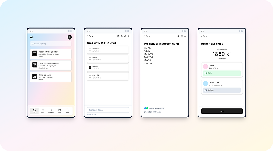
The key screens for my family management app, created with AI as an assistant.
Key Takeaways
Use as an Assistant
The quality of design that the agent (Figma Make, Claude, Gemini, etc.) provides is still flawed. But there are areas where AI can speed up your process by helping you complete manual tasks more quickly.
Learn when to actually use the agent and when to do it yourself. Only use it when it is helpful and not just for the appearances.
Critical thinking
I believe that critical thinking is your best friend here. Not everything the agent gives you will be of quality, and not everything will even be accurate. So it is important to think before, during and after using AI.
Always double-check the results. Is this contrast really okay? Is this in accordance with WCAG guidelines?
Begin at the Result
I've learned that the output you get from an AI works best when you know exactly what you want from it. This way, you can create very specific prompts, provide great context and clearly define what you want the agent to create for you. If you leave too much uncertainty or room for interpretation, the AI will never give you a result you'll be satisfied with.
And the app?
Hopefully there will be an app out there soon that you can try out. My ambition is to set up a vibe coding session together with a developer and try to build this together.
To be continued...